UNIT 1: INTRODUCTION TO VISUAL LANGUAGE IN ART & DESIGN
Past, Present & Future Postcards
For this unit I was required to create three postcards that each represent my interpretation of an event from the past, present and the future. In order to create these postcards, I developed compositional sketches as references to my final outcomes, of which a variety of images were collected and manipulated using Photoshop.
Sketches of postcards

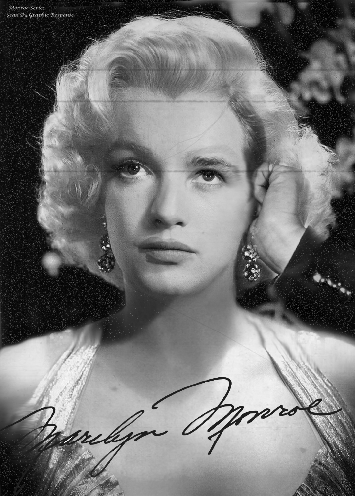
Past: Marilyn Monroe and her lovers
Marilyn Monroe was an American model and actress, famous for comically playing stereotypical ‘dumb blonde’ characters. She was born as Norma Jeane Mortenson on 1st June, 1926 and died on 5th August, 1962 as a result of an overdose. Monroe was one of the most popular Hollywood stars during the 1950s as well as the early 1960s and became a sex symbol in the 1950’s. Starting in a pin-up modelling career, Monroe progressed from minor film roles to becoming a popular actress in comedies and dramas such as ‘As Young as You Feel’, ‘Monkey Business’ and ‘Don’t Bother to Knock’. Despite her perceived ‘scandalous’ previous career, it increased interest in her rather than damage her career. Monroe’s legacy still lingers to this day, especially as a pop culture icon. Also, it is widely known that Monroe had many lovers in her life including allegedly John F. Kennedy, Frank Sinatra, Arthur Miller and Marlon Brandon. Therefore, I thought it would be interesting to merge Monroe’s life into a single picture, focusing on her love life, and perhaps bring her to life in the present day through my postcard from the past.

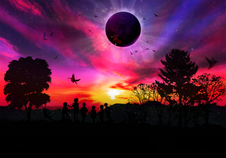
Present: Solar eclipse
The solar eclipse, where the moon blocks all or part of the sun, occurred on the 21st August 2017. This was a total eclipse that was visible to certain areas of the United States, Africa and Europe. Although total solar eclipses are not rare, a total eclipse happening across the entire United States only, during daylight hours in the summer season is very uncommon. Therefore, such an event was celebrated by many Americans and appealed to me as an important event for 2017. While having not personally seen a solar eclipse, I hope to create what the solar eclipse would have looked like and attempt to recreate a similar atmosphere as if the viewer is actually there in the moment.
 Future:
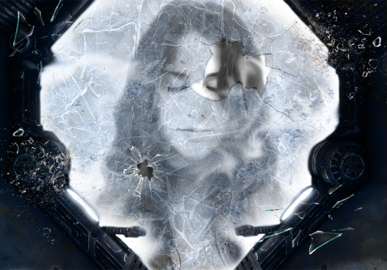
For many years, scientists have tried and failed in creating cryogenic sleep pods as the technology required to do so was too advanced. However, in the year 2073, scientists have finally completed their experiments and testing’s on creating cryogenic sleeping pods for humanity. As a joint effort of the most specialised scientists around the world, they were able to make a successful model. This was an urgent request made by the UN in 2050 in order to manage the rapid decline in birth rates and increase in death rates across the globe. This was the result of the lack of procreating due to the shared belief amongst humanity that work is of upmost priority. Consequently, more people began disengaging in the act of sex and more women were getting abortions. Also, humans’ life expectancies had decreased to 45 due to the allowance of harmful substances such as alcohol, cigarettes, drugs and many others that were invented to be sold to citizens at local shops. The device was created to enable an individual to go into a cryogenic sleep for any desired period of time without aging in the hopes that this would save humanity from extinction.
Later down the line in the year 2081, the original model was modified and distributed to countries. During this period, large centres were built to keep citizens safe while they were in their cryogenic sleeping pods. By 2084, people were signing up for their place in one of these pods at their local centres in order to be put into a cryogenic sleep at the beginning of 2085. Many were in favour of this invention due to wishing for a better, more populated future while some were sceptical in the devices reliability.
Final outcomes of postcards
Past
Images used:


This is my representation of the American actress, Marilyn Monroe, and her alleged lovers’ during her life. Similarly to John Stezaker’s work, who portrayed compatibility between two individuals in his marriage series, I have also explored the idea of the compatibility of individuals by merging Monroe’s lovers’ features to hers. Also, I collected photographs of famous actors and actresses who had relationships with Marilyn Monroe and tried to include distinctive features of them. These include Frank Sinatra, Joan Crawford and Marlon Brando. I added images of these figures in separate layers, reduced the opacity to merge the faces to Monroe’s and used the eraser tool to remove certain areas. In addition, I used the smudge tool to correct areas and align the figures to the image of Monroe. Then, I added a black and white filter to remove the colour and to make the image appear old as well as from the 1950’s. Furthermore, by adding noise and an old scratched film texture, I was able to make my postcard look aged and be influenced by the film industry during the mid-20th century. Lastly, to complete my postcard I included Monroe’s signature to make it appear to be an authentic postcard from the past.
Evaluation:
From my sketch for my past postcard, I achieved what I intended; to represent Marilyn Monroe’s love life in a single picture. Despite the removal of colour of Monroe and the ghostly effect created unintentionally, I believe I have still brought her to life as well as the 20th century film industry. This is due to the application of relevant textures, filters and combining people’s features who had relationships with her. The merging of these people’s features to Monroe’s is symbolic as it conveys that these individuals were a part of her and gained some insight into who she really was behind her persona.
On the other hand, my postcard could have been improved by including more famous actors/actresses or merging more prominent features such as the face rather than hands and clothes. Also, for a greater effect, I could have kept Monroe in colour as my aim was to regain life in her. Furthermore, the positioning of my images should be more conscious as for example, Frank Sinatra’s arm and Marlon Brando’s hair look awkward and prominent. For more authenticity, I could add a kiss stain next to the signature and adjust the edges of my postcard to appear to be tearing and folded. Overall, I believe this postcard was successful in achieving what I intended and portraying Marilyn Monroe’s past.
Development of past postcard:


Present
Images used:


This is visual representation of the solar eclipse of 2017 that occurred on the 21st of August. Similarly to David Hockney’s style, I have also used a landscape as the subject of my postcard. However, Hockney’s work is more vivid and childlike in the way it is made. Firstly, I chose an image of a sunset with the complementary colours of purple and yellow as well as orange and blue. In order to exaggerate these colours, I increases the brightness, contrast and saturation of the sunset. Also, I used the dodge and burn tools to lighten and darken certain areas of the sunset. These tools increased or limited the exposure of areas such as the clouds or the horizon. Then, I added a silhouette of a surface to create a horizon between the sky and land where silhouettes of trees and children can be seen. In addition, the solar eclipse was centred in the sky and embossed to emphasise focus onto it. Finally, sun rays were applied behind the solar eclipse as well as stars, birds and fireflies to emphasise the childlike nature of the postcard.
Evaluation:
Altogether, I believe this postcard is strong due to the vibrant, contrasting colours which, alongside the silhouettes of the children, portray a childhood aspect. This theme, often associated with youth and innocence, conveys similar sense of naivety to mine as I have not personally seen a solar eclipse. Visually, the use of stars, fireflies and exotic birds show the solar eclipse to have been a magical and beautiful moment as the children in my postcard are depicted to be staring up in awe of it. Also, the use of negative space through the contrast between the silhouettes and the sunset exaggerates the vibrant colours featured in the postcard.
However, the silhouettes used, which include most of the images, are monochromatic. Therefore, my postcard lacks the tone and form that makes a subject realistic. In response, I could have used coloured images and then applied a more subtle silhouette that has some suggestion of light. Furthermore, the fireflies could be made more vibrant as they are indistinct. Also, the three larger birds are very prominent. Thus, their brightness should be reduced to avoid attention being drawn away from the solar eclipse.
Development of present postcard:


Future
Images used:


This is my interpretation of the future to come; a world where people are in cryogenic sleeps. Taking an image of a woman with her eyes closed, I removed the background using the eraser tool and applied hard light. Then, I used the burn and dodge tool to highlight and darken particular areas of the female figure. This was to create a bigger contrast between the hair and the face as well as to remove the imperfections that weren’t erased in the hair. Next, I added a frozen layer and reduced the opacity to make it seem like the woman was behind the ice. Using an image of a hallway, I roughly erased a section to serve as the window of her cryogenic pod and applied luminosity to define it more. After, I used the smudge tool to create mist from the ice for a realistic postcard by smudging the edges of the roughly erased window. In addition, I added a frost layer to provide the window with texture as well glass cracks where I erased the layers underneath to show depth. Finally, I added shattered glass pieces to make the figure in my postcard appear to be awakening.
Evaluation:
Due to the perspective and angling of the shattered glass pieces, my postcard succeeded in achieving realism as they appear to be flying out of the postcard. Also, it achieved the visual effect of making the female figure seem to behind the ice whilst still retaining some clarity in the details of her face.
Alternatively, some imperfections are evident, such as extreme white areas around the broken glass window. Also, the mist created from the ice requires defining more as it is not visible or thick. Thus, I could consciously insert mist clouds into my postcard to exaggerate the coldness of a cryogenic sleep. In addition, the frost texture could be more visible. Perhaps the texture can be bevelled and embossed to give it form and 3-dimension.
Development of future postcard:


Artist research:
David Hockney


David Hockney is a British pop artist born on 9 July 1937 in Bradford , England. Hockney is a versatile artist known for his paintings, photographs and set designs. Hockney was born with sound-colour synaesthesia, a neurological condition where he experiences multiple responses to a stimuli such as seeing synesthetic colours when hearing a sound. Similarly to Kandinsky who is believed to also have had synaesthesia, Hockney’s work is multi-sensory as a result of his condition and can be seen in his stage designs where he bases background colours and lighting on the piece’s music.
The vast majority of Hockney’s paintings feature his friends, lovers and relatives. As well as portraiture, the subject of his postcards are of sceneries or landscapes. One of Hockney’s favourite subjects were his swimming pools of L.A. which can be seen in most of his iconic works such as ‘A Bigger Splash’. Also, as an open gay, Hockney openly explores the nature of homosexuality in his work such as ‘We Two Boys Together Clinging’ and ‘Domestic Scene, Los Angeles’ which depicts two men showering together. Perhaps, Hockney depicts such scenes which may be considered taboo as a way of tackling and transforming societies perceptions on homosexuality.
Hockney paints using acrylic which helps him to achieve vibrant colours. This may be a result of his synaesthesia that affects his choice of colours however his postcards still retain realism. Due to his vivid use of colours, his work appears childlike and often includes pastel colours. Furthermore, some may argue that his style expressionistic however others believed that he is more of a realist due to the accuracy in his work despite his use of bright colours. In addition, Hockney uses fragments of poems and quotes from Walt Whitman in his work which give his work meaning and suggest her is attempting to portray a particular message.
John Stezaker


John Grenville Stezaker is an English conceptual artist born in 1949 in Worcester. Stezaker studied at the Slade school of Art and is currently teaching Critical and Historical Studies at the Royal College of Art in London. Many of his works have been exhibited in renowned museums such as the Museum of Modern Art in New York, the Saatchi Collection and the Tate Modern in London. Also, in September 2012 he was awarded the Deutsche Börse photography prize for his work.
Stezaker produces photographic collages using classic movie stills, vintage postcards and photographs. From these old, outdated sources, Stezaker gives them new meaning through his collages where he crops, overlaps and adjusts images to merge them together. The majority of his works focus on portraitures of classic film stars, suggesting an interest in maintaining that era. Also, his interest in surrealism is quite evident in his collages due to the distortion he creates of familiar stars’ faces. For example, in Stezaker’s mask series, individual’s prominent facial features are hidden behind and replaced by coloured images of landscapes. In Stezaker’s other series, his marriage series, he couples male and female identities together into a unified piece of art to symbolise the similar unity created in marriage. In this series, Stezaker portrays the compatibility between two individuals as the landscape/ individual’s images merge easily.
Stezaker’s work focuses on the visual element shape as he portrays the similarity of patterns of the human face to patterns in nature. The use of monochromatic images, of which are either black and white or slightly tinted, contrast that of the vibrant images of landscapes. Thus, this contrast portrays the theme of old versus new. Furthermore, Stezaker uses negative space when collaging images of landscapes to film star’s face, especially in his marriage series. This is contrast is used to separate the features of one individual from the other. Personally, Stezaker’s work is very aesthetically pleasing due to the contrast in colours as well as the careful merging of individuals. Also, I really admire his style and his transformation of loved classic film stars through collaging them with colourful images of landscapes.
